The Worship School
Brand and Style Guide
Branding • Creative Direction • Art Direction • Marketing Strategy
Overview
After joining the team at The Worship School as Creative Director, I designed a refreshed new crown logo and identity for The Worship School. Originally an annual curriculum of monthly workshops the business was pivoting into a leadership conference events. The new identity was accompanied by a style guide to allow brand assets to be handed off to other designers creating event collateral and marketing materials.
Strategy
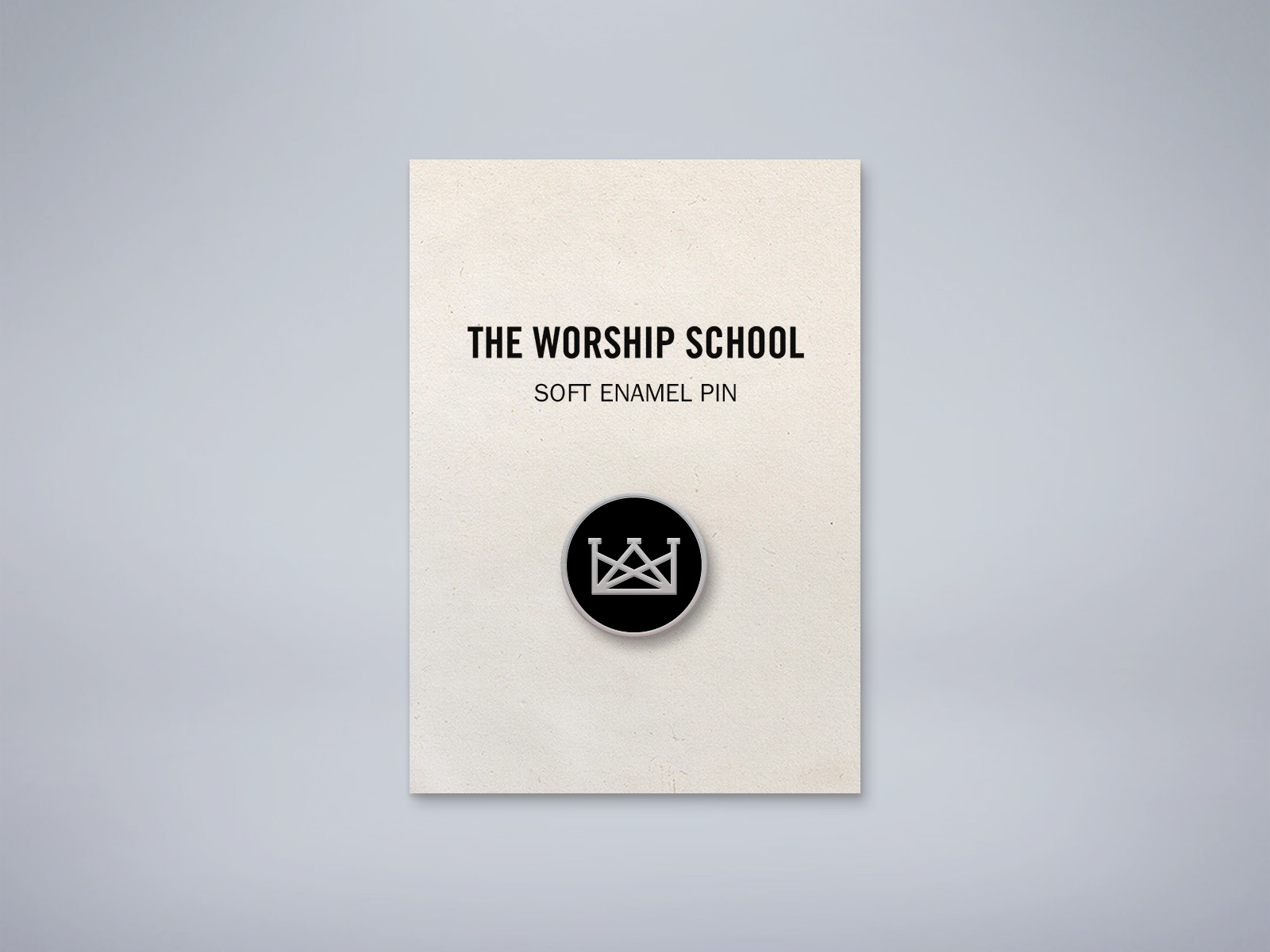
The original logo’s thin lines tended to disappear in layouts and busy imagery, and the wide orientation felt out of place for certain contexts. The new crown logo retained the angular crown elements with thicker stroke lines and overall narrower width. Place the moniker on a solid circle allowing the crown to be subtracted from the shape so colors and imagery would show through the logo.
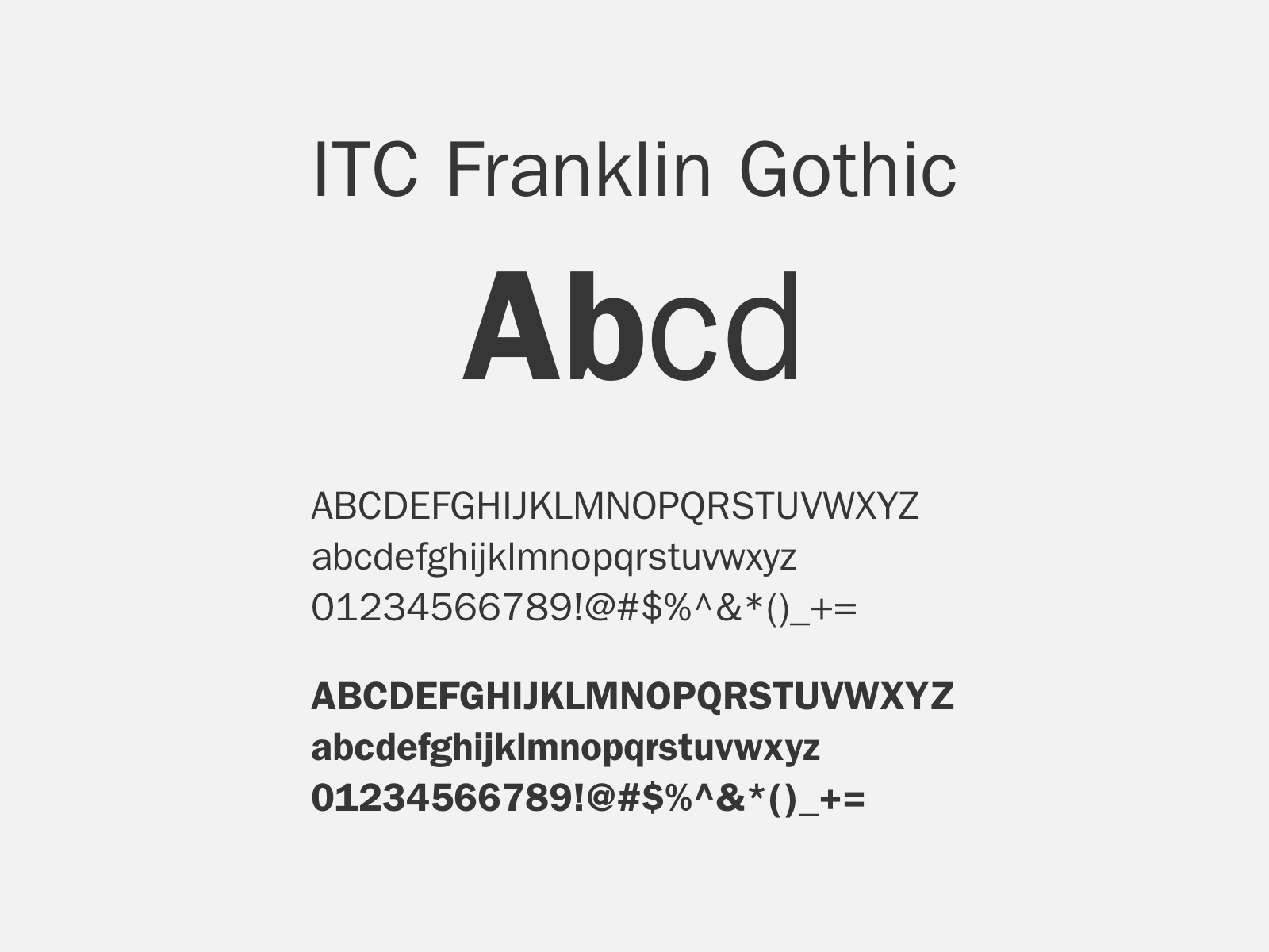
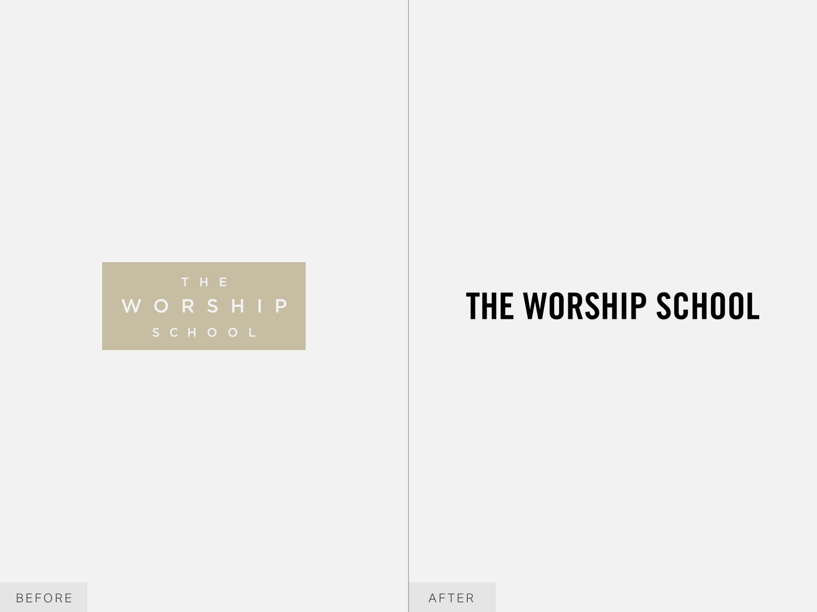
The ITC Franklin Gothic type family was chosen as the brand font for its utilitarian feel and flexibility in weights, as well being an ideal pairing for the new wordmark set in Trade Gothic Bold Condensed No 20.

Flexibility
The new logomark can be set in a square to fit social media profile pictures or on a single stroke circle to be used in conference merchandise such as enamel pins or embroidered hats.


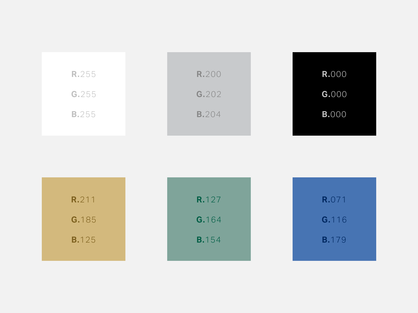
Color
The standard is for brand elements set in black or white with grayscale imagery—when promoting a conference these are paired with muted gold, moss, or cerulean duo tones set against a city backdrop wherever the conference is held.